
Certificates matter. They’re proof you did something worth doing, and that someone noticed. A shoddy one looks cheap, though, and hunting down a proper Border sijil cantik? That’s harder than it should be.
Find gorgeous borders and get them onto your certificates without the headache. Walk away knowing how to design professional certificates that people will actually want to display. We cover design basics, the best resources (free and paid), real tutorials you can follow. That’s it. No fluff, just the actual skills you need.
Let’s get started.
The key elements of an impressive certificate border
A certificate’s border does more than decorate it, it shapes how the whole thing feels to whoever’s holding it. You get the theme right, and the design suddenly clicks. That consistency? It’s what separates a certificate that matters from one that doesn’t.
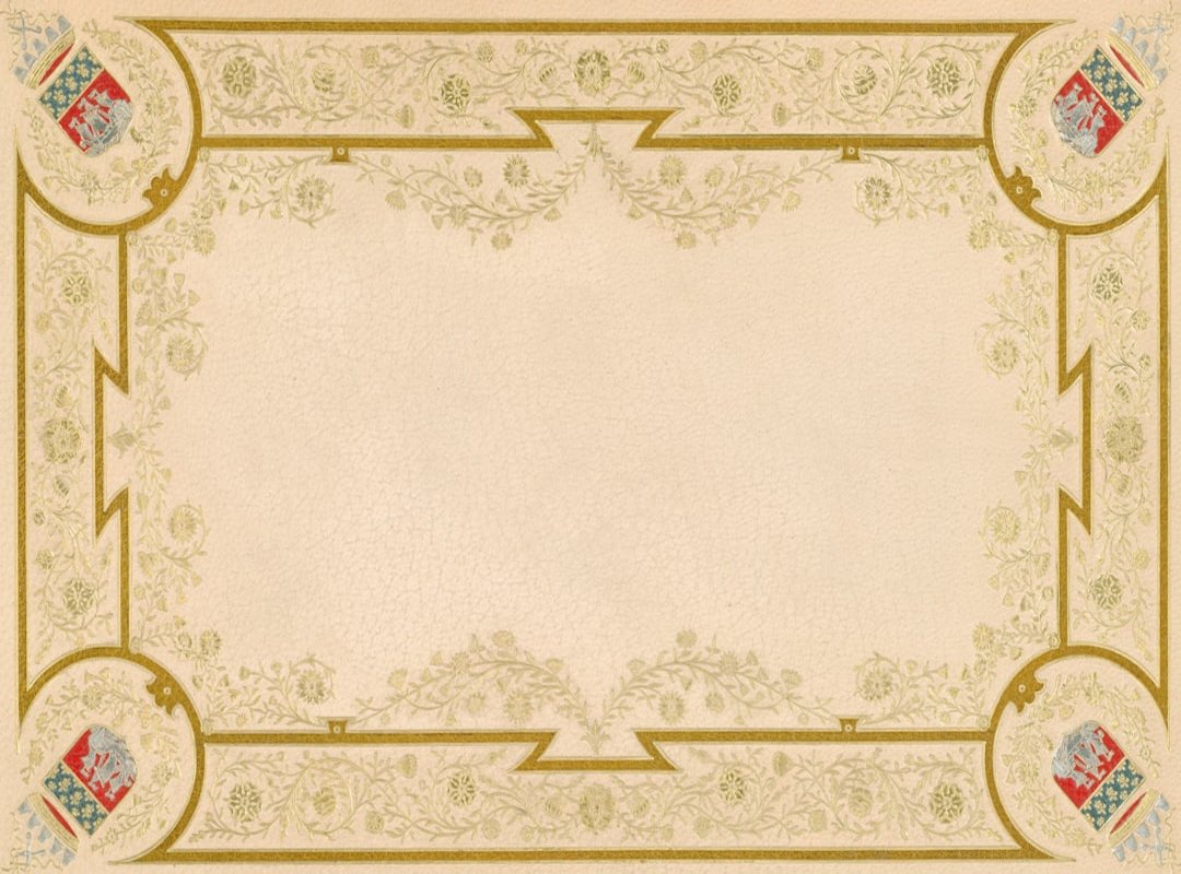
The border’s style should match the certificate’s purpose. A corporate award works better with a sleek, professional design, while an academic certificate calls for something more traditional and elegant.
Gold and navy blue work best when you’re after that prestige, that sense of formality clients expect in official documents. Bright colors, red, yellow, they’re a completely different animal, suggesting fun and achievement in ways the darker palette can’t touch. For kids’ certificates especially, those warm tones just hit different. They capture attention, make the moment feel earned.
Balance is everything. An overly busy border can distract from the main text. Conversely, a minimalist border can look modern and clean.
You want the recipient to focus on the content, not get lost in the details.
Resolution and file type matter way more than most people realize. High-resolution PNG files with transparent backgrounds? They’re the way to go. They keep the border crisp and sharp, no distracting white box lingering around the edges.
This is especially important if you’re using the border sijil cantik for a high-quality print.
Think about where that certificate’s actually going. Digital ones give you room to get creative, so you can go wild with intricate borders and layered designs. Printed certificates? They need to stay simple. Classic. Something that’ll look sharp on paper without turning into a smudgy mess. Here’s the thing: match the border to what you’re actually doing with it. That’s what separates a certificate that lands from one nobody ever looks at again.
Top resources for finding beautiful certificate borders
Border sijil cantik and beautiful certificate borders come in two flavors: free and paid. Most people don’t know how many genuinely good free options exist out there. So we’ll start there. The paid stuff can wait.
Free resources: canva, freepik, and vecteezy
Canva, freepik, and Vecteezy are great places to start. These platforms offer a wide range of cost-free designs. The pros?
You don’t have to spend a dime, and the cons? You might need to provide attribution, and the designs can be more generic.
Search for “certificate border,” “award frame,” “elegant geometric border,” or “official document template.” You’ll find what you need faster. These terms match what designers actually call them, not vague stuff like “fancy paper” or “document thing.” That’s the difference. Using the right language cuts your search time in half because you’re speaking the same vocabulary as the people who built these templates.
Premium options: adobe stock, shutterstock, and creative market
If you’re willing to pay, consider Adobe Stock, shutterstock, and Creative Market. These platforms offer unique, high-quality designs, and the benefits?
You get exclusive artwork and commercial licenses, which can be a big plus if you’re using the borders for professional or business purposes.
Built-in templates in software
Built-in templates in Microsoft Word and Google Docs shouldn’t be written off, they’ve got libraries of basic, functional borders that work just fine. Maybe not flashy. But when you’re rushing to finish a project, these templates’ll deliver what matters: speed without cutting corners on the essentials. The reality is simpler than hunting for custom designs. You get something that works, in minutes.
Pro tip: Search for ‘vector borders’ to find scalable designs that won’t lose quality when resized. This is especially useful if you need to print your certificates at different sizes. read more
What matters is matching your actual needs to your actual budget. There’s no one-size-fits-all answer here, sometimes you just have to try a few options and find what works for your situation. Test them. See what clicks.
How to add a border to your certificate: a step-by-step guide
Adding a border to your certificate can make it look more professional and border sijil cantik. Let’s dive into how you can do this in both Microsoft Word and Canva.
Using microsoft word
Open your document and head to the “Design” tab. Click on “Page Borders.” You’ll find a bunch of simple line styles to choose from. Want something with more personality? Hit “Picture” under the “Art” section instead.
This lets you insert a border image file.
To keep the border from getting in your way, set the image to “Behind Text.” You’ll be able to type right over it without any problems.
Using canva
Open a blank document in Canva. Click the “Elements” tab, then search for “border” or “frame.” Pick one you like and drag it onto your page.
Lock the border layer by right-clicking and selecting “Lock.” This keeps it in place while you add text boxes for names, dates, and descriptions.
Managing margins
One crucial tip: manage your margins carefully. Make sure your text doesn’t overlap with the border design. This ensures a clean, professional look.
Speculation. Tools like Canva and Word will probably offer more advanced, user-friendly features for adding borders down the road. Maybe AI-driven suggestions for the best border designs based on your content. Who knows? For now, these steps should help you create a polished, attractive certificate.
Creative border ideas for different occasions
Have you ever wondered how a simple border can transform a certificate? It’s all in the details.
Corporate awards work best with elegant, minimalist borders. Geometric lines or subtle gold and silver foil effects add sophistication without overwhelming the actual design, they’re the move when you want restraint. Clean is always right.
1. For academic achievements
Classic, traditional borders work best here. Filigree, scrollwork, or university-themed crests give that timeless, academic feel. Perfect for those hard-earned degrees and diplomas.
2. For children’s certificates
Kids love bright colors and fun designs. Stars, balloons, animals, school supplies, borders packed with these things grab their attention and stay with them. The better a certificate looks, the more it’ll mean when they actually earn it.
3. For modern events or tech certifications
Abstract, digital-style borders with gradients or clean, sharp lines nail that modern, tech-driven feel. They match what these events are really about, innovation. Pick the wrong border and the whole aesthetic falls flat. Get it right, and it changes how people see the work.
Choosing the right border sijil cantik can make all the difference. It’s about making the recipient feel valued and recognized.
Design certificates that people will cherish
A great border matches your theme, shows up across different platforms, and takes just a few steps to add. Get it right. When the design clicks, that certificate doesn’t just sit there looking official, it actually feels earned, like something worth framing instead of filing away in a drawer.
Pick one of the resources we mentioned. Find a Border sijil cantik for your next project. You’ve got everything you need now. Stop churning out generic certificates, they’re forgettable the moment someone walks away from the podium. Start designing awards people actually want to keep, the kind that end up framed on an office wall or pinned to a bulletin board years later.
 Ask Brenda Grahamandez how they got into ai and machine learning insights and you'll probably get a longer answer than you expected. The short version: Brenda started doing it, got genuinely hooked, and at some point realized they had accumulated enough hard-won knowledge that it would be a waste not to share it. So they started writing.
What makes Brenda worth reading is that they skips the obvious stuff. Nobody needs another surface-level take on AI and Machine Learning Insights, Zillexit Cybersecurity Frameworks, Gadget Optimization Hacks. What readers actually want is the nuance — the part that only becomes clear after you've made a few mistakes and figured out why. That's the territory Brenda operates in. The writing is direct, occasionally blunt, and always built around what's actually true rather than what sounds good in an article. They has little patience for filler, which means they's pieces tend to be denser with real information than the average post on the same subject.
Brenda doesn't write to impress anyone. They writes because they has things to say that they genuinely thinks people should hear. That motivation — basic as it sounds — produces something noticeably different from content written for clicks or word count. Readers pick up on it. The comments on Brenda's work tend to reflect that.
Ask Brenda Grahamandez how they got into ai and machine learning insights and you'll probably get a longer answer than you expected. The short version: Brenda started doing it, got genuinely hooked, and at some point realized they had accumulated enough hard-won knowledge that it would be a waste not to share it. So they started writing.
What makes Brenda worth reading is that they skips the obvious stuff. Nobody needs another surface-level take on AI and Machine Learning Insights, Zillexit Cybersecurity Frameworks, Gadget Optimization Hacks. What readers actually want is the nuance — the part that only becomes clear after you've made a few mistakes and figured out why. That's the territory Brenda operates in. The writing is direct, occasionally blunt, and always built around what's actually true rather than what sounds good in an article. They has little patience for filler, which means they's pieces tend to be denser with real information than the average post on the same subject.
Brenda doesn't write to impress anyone. They writes because they has things to say that they genuinely thinks people should hear. That motivation — basic as it sounds — produces something noticeably different from content written for clicks or word count. Readers pick up on it. The comments on Brenda's work tend to reflect that.